


The "Wedgwood problem"
Jeopardy! needs to be tighter in the production of its video clues.

The “Wedgwood problem” to which I refer is best explained in four images, each taken from a video clue.

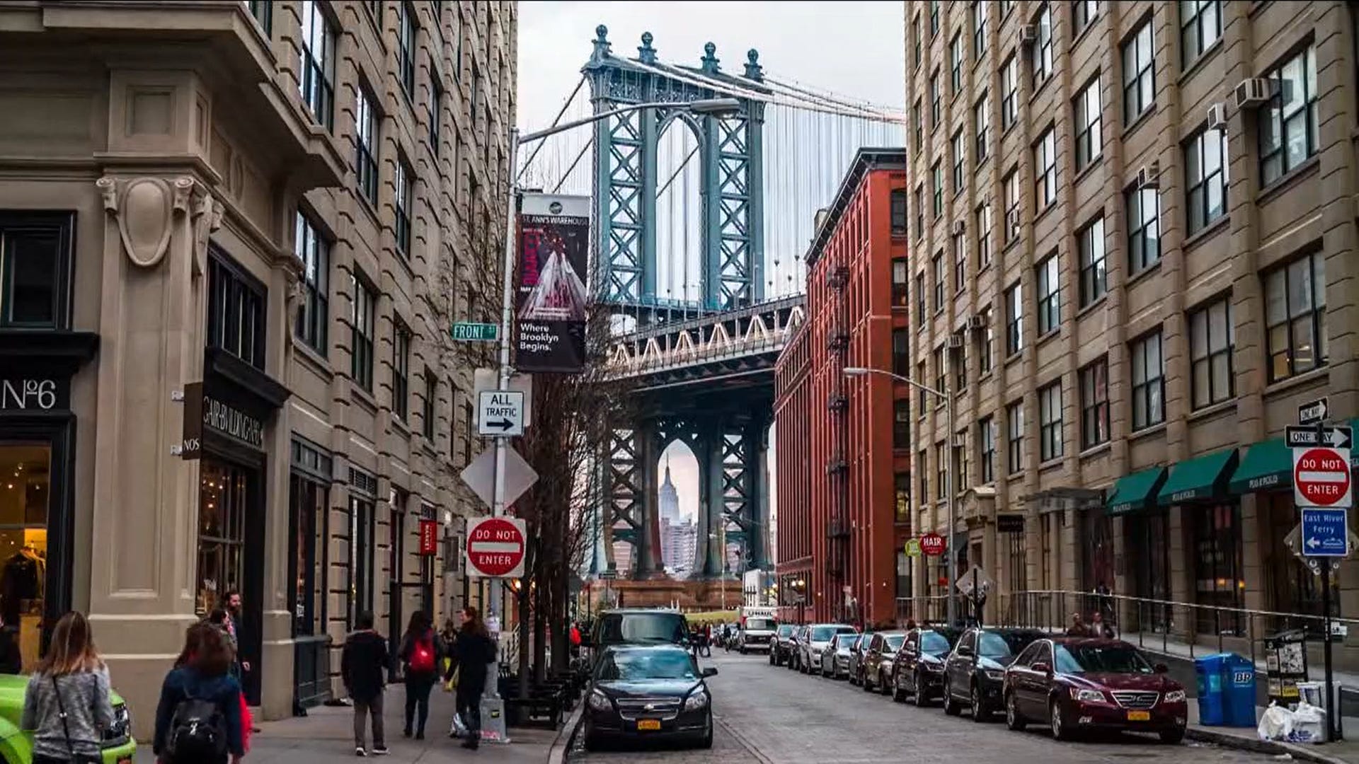
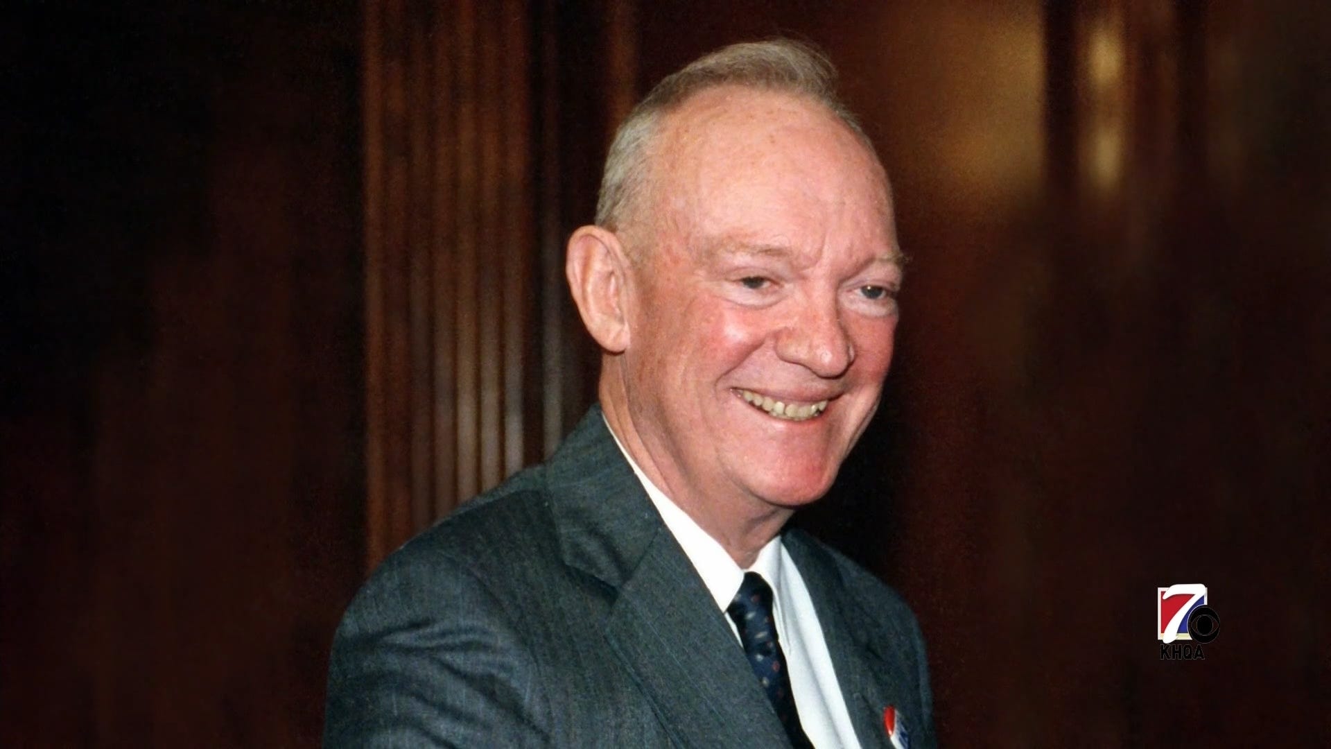
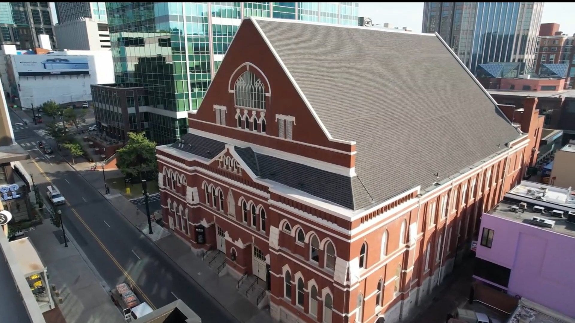
What do these seemingly four disparate pictures have in common? Each arguably has text within it that gives away the correct response (“Wedgwood,” “Brooklyn,” “Ike [Eisenhower],” and “Ryman,” respectively).
The first, “Wedgwood,” gives its name to this because not only because it is the earliest of the four, but it was extremely consequential in the game in which it appeared. Christine Kim converted a True Daily Double on the last clue of Double Jeopardy! to bring herself to exactly two-thirds of Brian Quinn’s score; with a zero wager in Final, she won by a single dollar.
I present the images in order of legibility of the key words, from most to least. It was generally agreed that “Wedgwood” could be read in the first one. That also seems to be the case for “Brooklyn” in the second one. On the other hand, while I initially thought I could make out “Ryman” in white on the black sign in the final one, upon looking at it again, it’s not legible from the image. Most likely, upon originally viewing the episode, I figured out the clue, noticed the sign, and deduced post hoc that “Ryman” was in the large type at the top of the sign.
It’s “Ike” on the button on John Eisenhower’s lapel in the third image, from the game this past Thursday, that brings this to the fore again.
This got contentious
As J! Archive noted the visibility of “Wedgwood” but not any of the others, I submitted correction suggestions regarding “Brooklyn” and “Ike.”1 The former was accepted, the latter rejected.
As was later explained, “Ike” would not have been discernible to a contestant on stage, while “Brooklyn” was large enough to have been. Fair enough. Even I agree on that. More importantly, so does Emily Sands, the player who faced that clue this past Thursday (it being a Daily Double, she alone did). As she said:
Wow - I definitely didn't see that from onstage, and could barely see it even knowing it's there now.
The video clues are displayed on a 70-80" TV monitor that's all the way across the stage from the contestant podiums. It's probably ~30 feet away?
If the standard of the J! Archivists is “something that contestants on the Alex Trebek Stage could have reasonably noticed” is theirs for taking note of details like this, so be it. I think that’s incomplete, as Jeopardy! is as much for the home viewer as for the three contestants at those lecterns. But I accept that as a valid exercise of positional authority. (In other words — I still think they’re wrong, but it’s their project and their website.)
Note I said “later explained” above. My big problem was the initial justification for the rejection: “Looking at this clue to get the capture of it, all I can really see is red and white; I can't actually see IKE there.” This incensed me, and I went to my keyboard far too quickly. I was most uncivil and intemperate, and for that I apologize. But I really did think that I was being told, by a subject matter expert, that something I was (and still am) certain I saw wasn’t there at all. I should also add that I caught “Ike” at normal speed and magnification, without pausing. No Zapruder-esque analysis was involved. Regardless, it’s a good reminder that something you’re absolutely convinced is an empirical fact may actually be a normative question. This is something worthwhile to remember — because any one of us may find ourselves in a situation in which the positions are reversed, and the shoe is on the other foot.
This shouldn’t even be an issue in the first place
None of these four examples – or at least, none of the first three – should have reached the screen. The show has to do better with the quality control on the images it uses in its clues. As I said above, Jeopardy! is as much of a game for the home viewer as it is for the contestants in the studio. That’s a huge part of why it’s lasted so long. Even if details in the pictures aren’t clear enough to tip correct responses to the contestants, there shouldn’t be any such details discernible to the audience at home.
I don’t think there are any issues with altering the images that Jeopardy! uses, at least insofar as objections from the entities the show licenses them from (Getty Images, Shutterstock, etc.) I recall instances of images where giveaway text would have been much larger, and thus much more visible, but they were intentionally obscured in the production process.2 I think the show already has the capability to solve this problem; it just has to apply that capacity more widely and broadly than it already does.
Mr. Davies, & Ms. Loud and Mr. Wisse, and the whole team: every time you make an image part of a clue, put it up on the same 70-80” monitor upon which it appears to the contestants. But scrutinize it from a foot and a half or two feet away, as a home viewer might while streaming the show on a monitor or a tablet. Doing so might not quite go all the way to solving the “Wedgwood problem,” but it would get us most of the way there.
I did not submit a correction for “Ryman,” for the reasons stated above; I include the example for completeness.
I don’t like to say this, but you’re going to have to take my word for it. If any reader can detail the specifics of any such instance, please do contact me or comment below.